Dark Mode 🌑
From the beginning, as soon as dark mode became a thing, I was hooked. Much to my own detriment, I use my phone in bed, and not having my corneas scorched every so often was definitely a level up in my life.
However, dark mode support has been trickling through our apps quite slowly really. Despite my best efforts, it’s still not infrequent that I’ll be scrolling on my favourite time sink, with duly dimmed colours, I’ll click on a link and it will open a website (in a webview, why is it always a webview?) and it will nearly blind me, as well as adding some strain to my relationship.
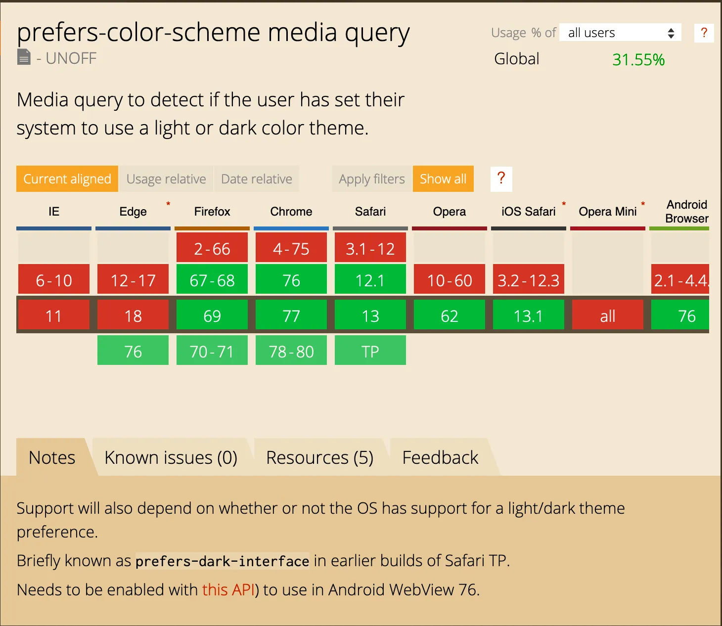
But fret not, browsers are now adding dark mode support, to the excitement of the whole web community (or maybe not, maybe it’s just me, but I’m excited 😄). It comes in the form of a media query, and it’s in draft status, unofficially supported by browsers.
Support is already in a good place, and there’s little else out there better suited for progressive enhancement. If your browser doesn’t support it, everything stays as is and it’s just browsing as usual.
This is the caniuse for the feature:

When I heard of it, I immediately decided to add dark mode to my site, and a mere 9 months later, here we are 😅
I have very specific ideas for the aesthetic of my site, despite having implemented none of them thus far. One of the things I’ve wanted to do from the start is support multiple colour schemes, so this felt like a good opportunity to explore that a bit more.
Since I use Gatsby for this site and it’s React based, I decided to use styled components, as I really like the idea of encapsulating styles along with the components, and it has a really powerful theming capability.
For the dark mode support to work with that, though, I had to access the prefers-color-scheme media query from JavaScript.
Huh 🤔
I gave it some thought, but nothing came to me (cause that’s not how tech works). So I googled aggressively and found this lovely function: Window.matchMedia() - Web APIs | MDN
So I had a play with those tools and got something working on Glitch:
That’s my target for theming, but for now I only added light and dark mode
support to the side. I’ll add more themes once I update the design and
components - coming soon™.
It’s been quite an easy feature to implement, to be honest. I spent a great deal of time reading about different approaches and deciding how to go about it, but once I made up my mind, it was quite straightforward. And it was fun! I love playing with colours, so I had a blast doing this.
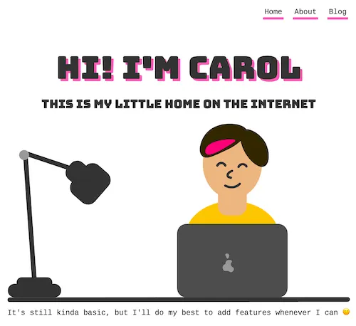
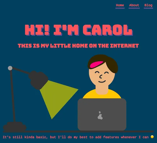
So here it is:


Hope this helps if you’re looking to add dark mode support to your site. And if you need any more support, give me a shout 🙂