FFConf 2018
I first read about FFConf on Twitter, and everyone had only the highest praise for it. I decided to attend as I wanted to hear a bit more about the web side of things.
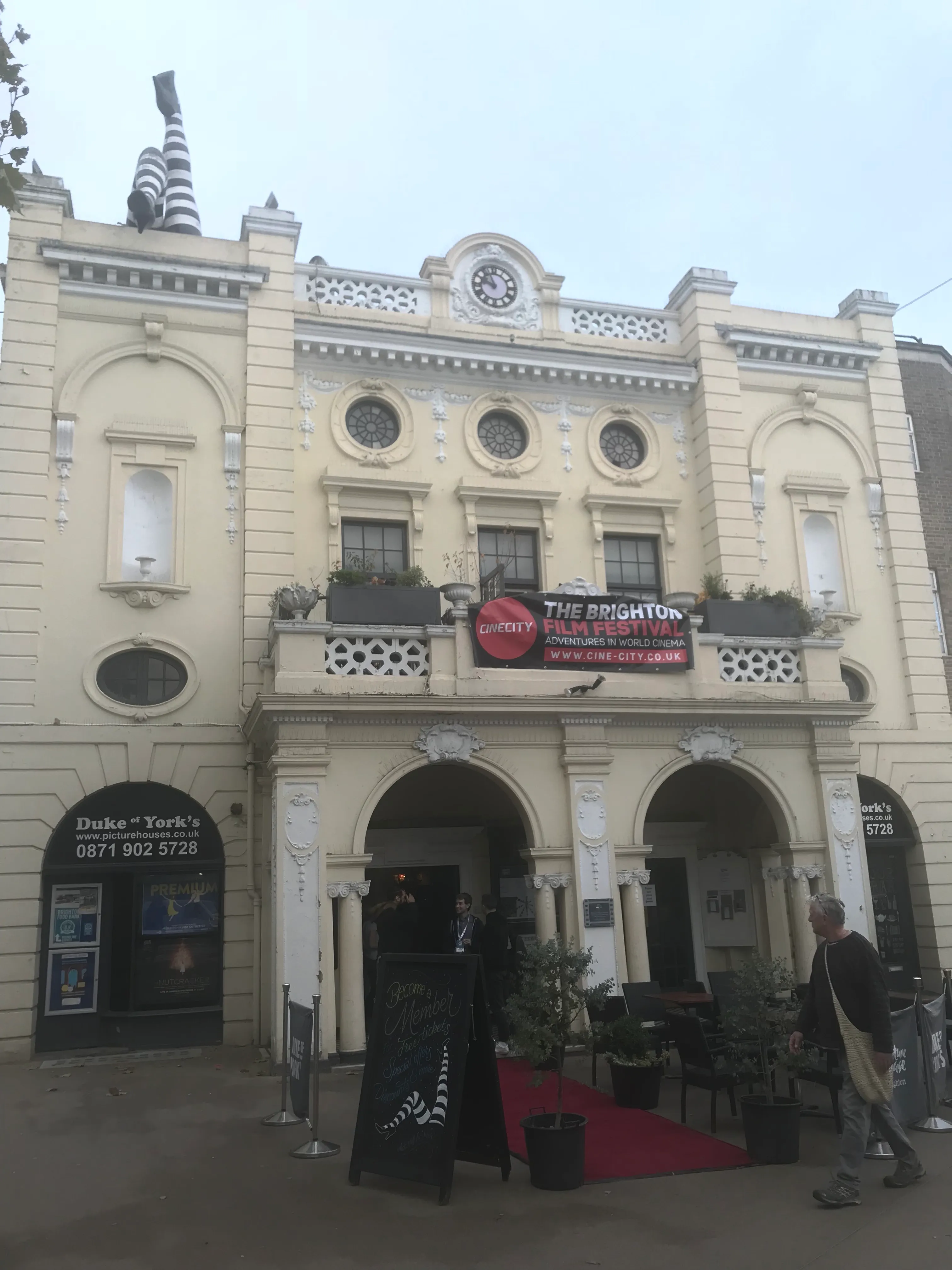
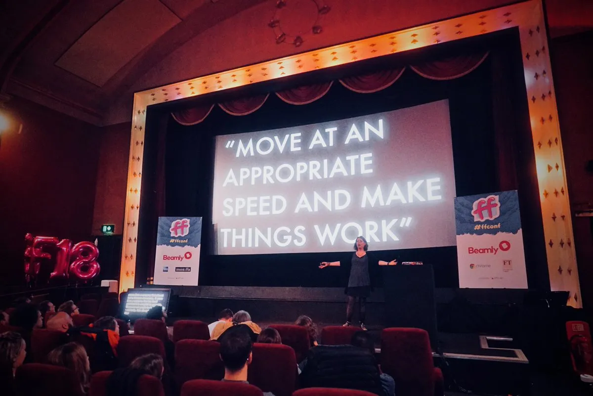
The conference is held in a lovely cinema, which meant that it was a bit dark but the seating was so comfy! ☺️

📸 Duke of York’s Picturehouse
Soon after I arrived, I met the lovely folks of Elixel:
✨
@elixelofficial
team + Carol ready for
#ffconf
— Natalia Waniczek 👩💻🏋️♀️🐕 (@natkuTala)
November 9, 2018
And soon after that, we took our seats ready for some talks!
Talks
Mentoring: being the help you wish you’d had
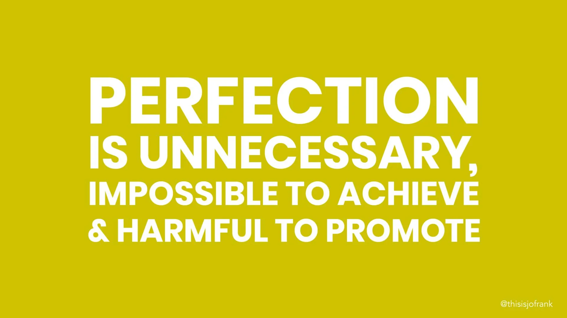
Jo Franchetti kicked us off with a lovely talk on mentoring. She highlighted the myriad benefits for both mentor and mentee. Teaching others will help cement your own knowledge, and it will make your knowledge useful. Answering questions also increases your reserves of patience. She gave us tips on how to do better when mentoring: it’s very important to avoid assumed knowledge syndrome. She left us a powerful quote:
Assume zero knowledge and infinite intelligence.
From the mentee point of view, she advised we stop worrying about not knowing things, and used that energy to learn new things.

She concluded by introducing us to the concept of Firgun: genuine, unselfish delight or pride in the accomplishment of the other. 💛 It was a great talk, and it motivated me to find mentorship opportunities very soon!
The future of JavaScript and Machine Learning
Eleanor Haproff taught us all things Machine Learning in JS. She explained how ML works and what the differences are between it and Artificial Intelligence and Data Science. She put it in a very clear and concise way:
- Artificial Intelligence: simulating human brain function.
- Data Science: solving complex problems using data.
- Machine learning: learning from data.
She then took us through how to use Tensorflow.js, and followed with some demos. Those were fantastic, and featured Asim Hussain playing Pac Man by moving his head into a quadrant among others. Eleanor also co-built aijs.rocks, which curates AI focussed JavaScript apps, and is a great place to get inspiration to build your own 🙂
Practical web animation
Lisi Linhart gave a really awesome talk on web animation 🙂 She went over the best situations in which to use animation, so that it can be a really powerful tool in our web experience, rather than a distraction or annoyance. Some examples are:
Attention & Feedback
This is perhaps one of the most important areas where animation can have a really great impact. Reacting to users’ input clearly and making system activity visible makes for great user experience, as users feel in control of the process. On the attention side of things, animation can be used to draw users to a particular action you want them to take, or even reward their engagement with something amusing 😀
Perceived Performance
Carefully choreographed animations can capture the user’s attention and provide a sense of fluidity that makes the load time almost imperceptible. On this subject, Lisi shared a great quote:
Human perception of time is fluid, and can be manipulated in purposeful and productive ways. -Chris Harrison
She shared a great example of this done well: Tom’s Wholesome Food Cafe
She also delved into the technical considerations of different types of animations, giving us great tips like what is cheap for the browser to animate: position, scale, rotation and opacity. She showed us how layers can help optimise elements that get animated frequently, and how to best use our tools to animate efficiently. Browser development tools are really powerful. For instance, they allow us to throttle CPU so we can test the user experience on low spec devices, or even to run through the repaints on each animation, so we can make sure we’re repainting only the intended element.
She went over different implementations of animations, from the classic CSS animations all the way to the brand new Web Animations API, highlighting their advantages and disadvantages. Her talk was full of great examples and resources, so I recommend you have a look 👀
Is it possible to build a truly diverse community?
Jenny Wong told us about her experience organising WordCamp 2016, and her efforts to make the event truly inclusive. When pondering ‘What would an accessible event look like?’, the organisers decided to ask themselves the following questions when prioritising any aspect of the event:
Does [blank] make the event:
- More accessible
- Less accessible
- Stay the same
If the answer was 1, it would get bumped to the top of the priority list; if it was 2, it would get pushed to the bottom and 3 would leave it somewhere in the middle. They found it a powerful recipe to work out what truly made a difference in making their event as accessible as possible.
There is no denying that having a big budget makes things easier, but there are things you can do for free. Crafting your content with care, using gender neutral pronouns and a suitable tone of voice goes a very long way to showing what kind of space your event is. Jenny also shared their experience providing child care at WordCamp. While it is costly and vetting professionals is difficult, it does make a big difference to parents. Their creche was under-utilised the first year, but having it in the first place let parents know that this was an event they could attend, and as a result the following year it was full.
Jenny also highlighted the importance of self-support. It makes things simpler for everyone involved if attendees can support themselves using the structure of the event. Providing specific spaces like a quiet room, lactation room, multi faith room and adequate signing help attendees navigate the space independently.
She went over a lot of steps you can take, and they’re too many for me to list here, but make sure to check out their playbook if you’re running an event:
WordCamp 2017 Organisers & Volunteers Playbook
Finally, Jenny talked about the impact of their work. I was shocked to see a screenshot of this very blog on her presentation! 🤯 I’ll explain: I blogged about the lovely DevOpsDays London 2018 conference, and I specifically mentioned how inclusive I found the event. It turns out Jenny had had a call with the DevOpsDays London organisers, to share her learnings on running inclusive events and help them apply those to their event.
It was quite interesting to watch Jenny’s talk and relate things to this experience I’d had fairly recently, only to find out later she’d been involved all along! 😮
It was a really great talk, and if you’re an event organiser, please use these learnings to make your event as inclusive as you can 💛

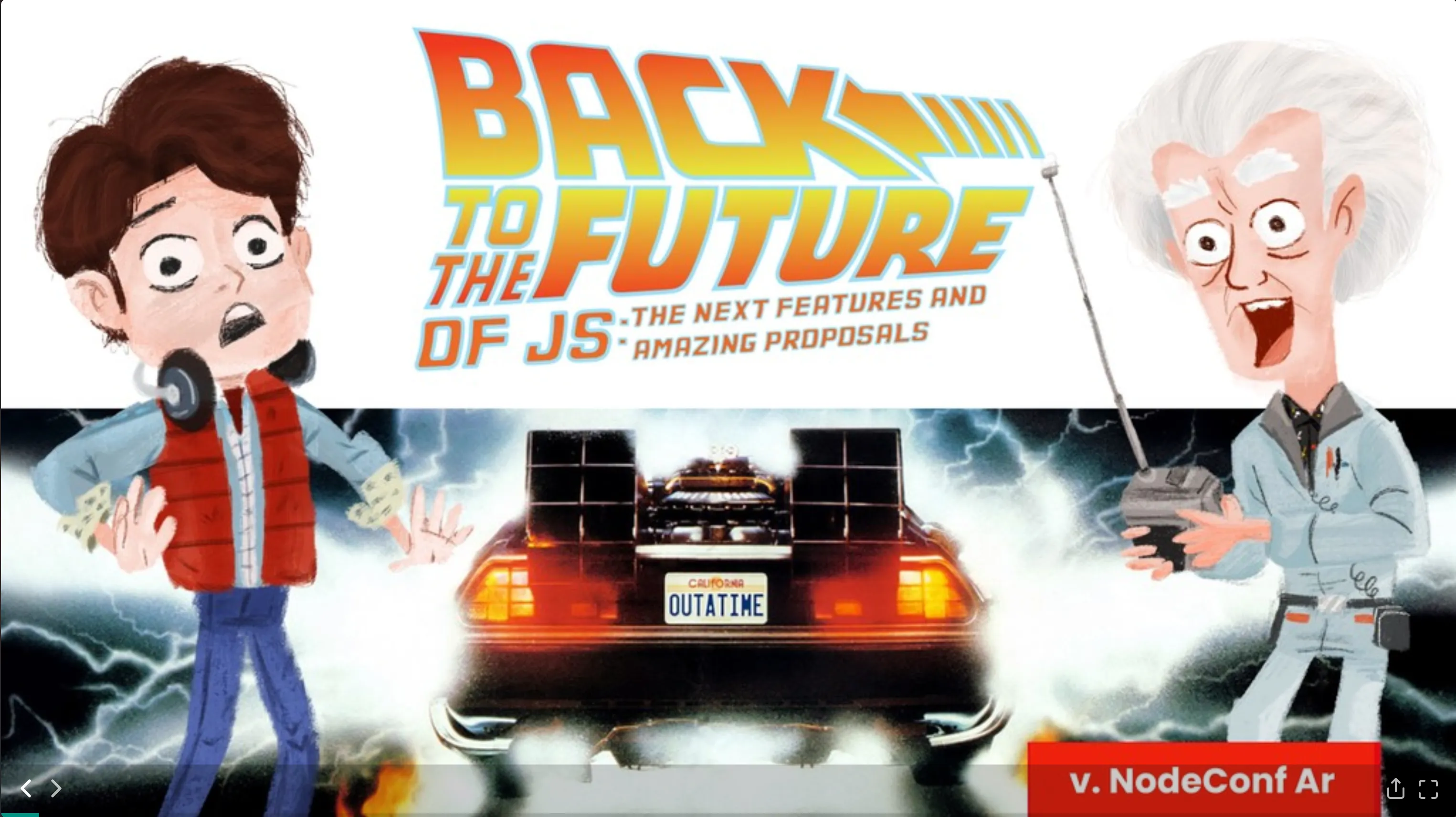
Back to the future of JS: the next features and amazing proposals
Willian Martins gave us a really hands on tour of a few proposals of new features for JavaScript. It covered the following features:
- Bind operator ::
- It allows you to bind this to a function more easily and extract methods
- It has a unary syntax -> ::context.method()
- And a binary syntax -> context::method()
- You find out more about it here
- Pipeline operator |>
- Syntactic sugar for function composition
- Allows you to pass a value through a series of functions
- Gets complicated if any of those functions require any more parameters
- Smart pipeline #
- Allows for # to be used in functions with parameters subject to change
- F# pipeline:
- Adds a new await step, which waits for the resolution of the previous step
- Partial application:
- Allows you to ‘bake in’ one or more parameters of a function
- You can use the token ? for a single parameter
- You can use the token … for multiple parameters
- Works on template strings 😀
Throughout his demos, one things that caught my attention is that his code was running as he typed it in his editor 🤯 He mentioned he uses Quokka.js so that’s a new tool I’ll be adding to my IDE 🙂
It was really cool to see where JS is going, and if you do have the time, please check out Willian’s slides, they are beautiful 😍
Dear developer, the web isn’t about you
Charlie Owen gave an inspirational talk, that encompassed the whole history of the web, the good parts and the bad parts.
Her main focus was reminding us that HTML is incredibly robust. It’s what allowed us to be adventurous and innovative throughout the times. Whatever we wanted to build, HTML would accommodate.
But then the browser wars came, and innovation stalled as developers had to effectively create two versions of their site to reach all users. But then… the iPhone was created, and the necessity of building responsive sites brought web innovation back with it.
We’re now at a stage where web developers value more the ability to use new frameworks than the actual usability and accessibility of the site. So we ended up in a situation where the average site is ~2.5MB and relies on JavaScript by default, instead of our lovely and robust HTML.
Charlie also described the strategy used at Springer Nature, where she works. It’s a super interesting strategy, it’s called Cutting the Mustard, and was originally developed by the BBC. It consists of running some lines of JS to determine the features available on the browser being used. If those tests determine that the browser has all the latest features available, you’re then free to serve your site with all its bells and whistles. But if it doesn’t, you can serve them a basic version of site, and that way you don’t need to exclude anyone 🎉

It’s so important for us as web developers to check our digital privilege, and make sure we concentrate our efforts in including rather than excluding.
She made her talk into a site that you can go and read yourself, and trust me, you should!
Using a modern web to recreate 1980s horribly slow & loud loading screens
Remy Sharp took us back to the 80s!
He told us about his quest to recreate the sounds and aesthetics of the Spectrum loading screens. From working out the pulse that the Spectrum generated and translating it into binary, to using his 1337 hacker skills (bitshifting) to draw the loading bars on a canvas, he managed to recreate the Spectrum loading experience to a tee!
He also did an impressive demo of his “image oldifying process” on an actual Spectrum! Check out the video below ⬇️
Here’s @rem showing off his 1337 hacker skills (
#bitshifting
) by rendering an image he took of the
#ffconf
crowd in an actual Spectrum! 😄 pic.twitter.com/7v0wxmGYcr
— Carol 👩💻 (@CarolSaysThings)
November 9, 2018
The talk was really great fun, and showed just how much you can learn from having a fun idea and running with it 🙂
Weird web & curious creation
Tim Holman was our last speaker of the day, and he had us in absolute stitches the whole time!
I found his talk really inspired us all to take ourselves a bit less seriously, and build things that are fun! He showed us some of his quirky creations, of which my favourite was Elevator.js.
After each demo, he listed all the things he’d learnt from working on each of those projects, and those lists were super impressive.
His generative art documentation is insanely cool! Not only does it teach you how to create cool generative art, it also runs the code in each example while you scroll the page 🤯
Check out the awesomeness here.
Wrap up
FFConf was an amazing, information-filled day for me. It had interesting, innovative, inspiring, funny talks and individuals, and I really hope I can go back next year 💖