Rebuilding my site - Part 5: Font Tweaks, SVG & Colour
Adding a splash of colour to this place 🌈
It’d been a little while since I made any progress on my site 🙇🏼♀️
I think aiming to document everything has really been slowing me down, so I might cut this series short in future.
For now though, let’s get into it:
Font adjustments 🔡
As soon as I finished the last post, I immediate started hating the header font 😅
So I set out to find a new one!
I browsed all my favourite font sites, and even found a new one: Beasts of England has some really great fonts, but unfortunately they’re not licensed for web use.
I settled on Briston in the end, cause it had some smooth curls ➰
I also realised my font sizes weren’t great. So I reached for Utopia, a fluid typography system recommended by Andy Bell on his Eleventy course. I know nothing about typography scales, so it was super handy to have something that looks good out of the box ✨
Utopia was super easy to use, I’m happy to report. You choose one of their scales and get some CSS out, simple as that! Here’s what I ended up going for:
:root {
  --step--2: clamp(0.91rem, 0.89rem + 0.1vw, 0.96rem);
  --step--1: clamp(1.09rem, 1.05rem + 0.21vw, 1.2rem);
  --step-0: clamp(1.31rem, 1.24rem + 0.37vw, 1.5rem);
  --step-1: clamp(1.58rem, 1.46rem + 0.59vw, 1.88rem);
  --step-2: clamp(1.89rem, 1.71rem + 0.89vw, 2.34rem);
  --step-3: clamp(2.27rem, 2.01rem + 1.29vw, 2.93rem);
  --step-4: clamp(2.72rem, 2.36rem + 1.83vw, 3.66rem);
  --step-5: clamp(3.27rem, 2.75rem + 2.56vw, 4.58rem);
}
Colour 🎨
Ok, let’s get this out of the way, I suck at design 😅
But I did want my website to be colourful, and I’m in a really big pastel phase, so you can see where this is going 😄
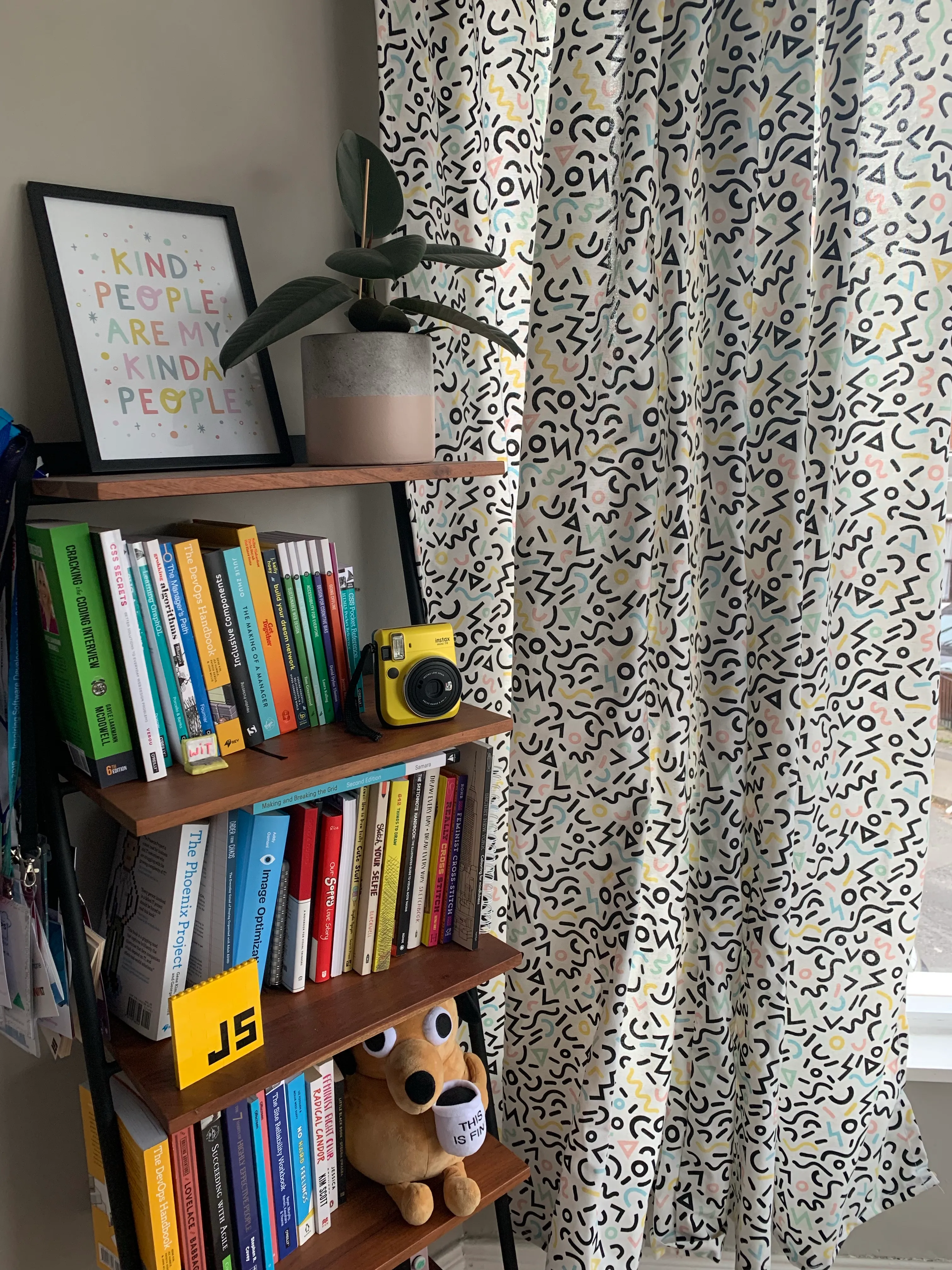
A few months ago I found some fabric that went well with the pastel decor in my office, so I made it into some curtains:

I really loved the pattern so I decided to try and recreate it in SVG! It took me a while cause I suck at Illustrator, and because I spent some time trying to make it a generative pattern, but I got there in the end 🙌🏼
While I didn’t succeed in making this pattern generative — mostly because I wasn’t sure how to cram the shapes very close to each other — I did have a great time playing with generative SVG 🥳
If you wanna give it a try, I highly recommend George Francis’ Generative SVG Starter Kit. It’s a great tutorial to get started and the Codepens are really helpful for you to experiment with ☺️
CSS 💅🏼
Once I had the pattern in, I did some light CSS-ing, mainly to spice up the header bar and navigation, and the blog post links.
I kept it light for now, but I’m excited to experiment with some animation in the near future 💫
And that’s it for now, folks! See you next time 💛